Having taken off the summer from writing and by and large researching as well, it has been since the start of the year since I have posted a forecast for the U.S. economy, too long (since my last forecast only extended to June of this year). So today I post my predictions for the rest of the year and beyond, as well as talk a little bit about the background work that went into the formulation of said forecast as I’ve tweaked the statistical model and mathematical formulas that culminate in this particular set of predictions about the near future of the economic environment in which we live and conduct business.
I’ll start with my predictions and then move to a discussion of the behind the scenes stuff. I predict that for the final quarter of the year we will see the economy grow by between -0.56% and 1.8%, with a likelihood of being around 0.6%. Assuming growth does come in at 0.6%, this would put the annual economic growth at just below 2% for 2016. This is well below the historic average of roughly 3.2% but only slightly lower than the 2.07% average for the years since the 2007-2009 financial crash. For anyone who is curious, average U.S. GDP growth during those three years was -0.36%.

For a more visual representation of my forecast, as well as a rough breakdown of my forecast by components the following is a visualization generated using Tableau. This is a copy and pasted image rather than an embedded visualization; I have recently found that WordPress has some restrictions on what can be embedded here that don’t work well with Tableau, a version of the viz with an interactive time feature can be found on my Tableau Public page here.

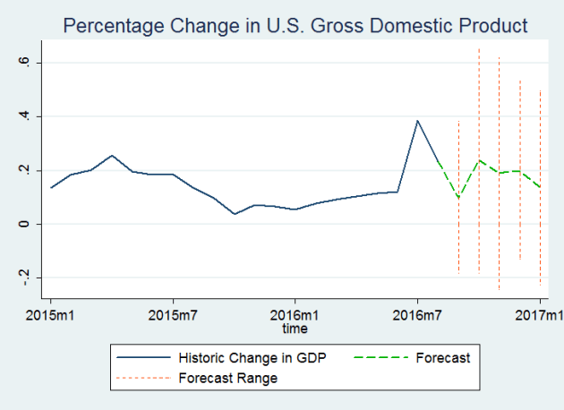
The forecast displayed in the graphs above is not actually my final product, but a step in the process. I include it to provide an idea of what the categorical breakdown of different components of the economy will look like, however my final estimates have been adjusted from the totaling of these components to adjust for forecast accuracy and calibration. What we can see here is that while net exports seems to be the component that changes the most, it is also the smallest contributor to the size of the economy, so in actuality the biggest driver of change here is likely going to be a predicted slight upward swing in consumer spending. I think this is a very reasonable change to expect to see here as it corresponds with the holiday season when we typically see a rise in consumer spending. Finally the following is a line graph of my finished predictions.
Now that I’ve gotten through the exciting stuff I’d like to take a moment to address some of the behind the scenes. So if you’re only interested in the results of my forecast and don’t care to get into more technical jargon, you can safely read no further.
As I’ve talked about in previous posts on the subject, I actually use two different econometric models to forecast GDP and take a weighted average of the two as my final product. Only one of these two actually forecasts all of the individual components that make up GDP, which is why the breakdown graphs above don’t display my final predictions; they are only half of the equation. Since I have started semi regularly publishing these forecasts I have changed the method in which I weight my models to average the two. With my initial publications I used a weighting system that involved correlation coefficients between the actual historical data and a collection of past predictions made by both of my models dating back to 2011. I have since replaced this with a measure called MAPE, or mean average percentage error. The MAPE approach more directly takes forecast error into account, therefore more directly weighting the models by their respective accuracy. I believe it is also more in line with standard practices used in the forecasting profession.
I have also used MAPE as an evaluation tool in refining my models, and have recently tinkered with one of the two models that I use, and have found a new variation of control variables that provides a more accurate specification as measured both by MAPE and the Granger causality test. Therefore this forecast and others moving forward should be more accurate than those of the past due to modeling improvements.
The other behind the scenes sharpening that I’ve made to my predictions this time around is to re-calibrate both models’ interval forecasts since I now have an additional year and a half of historic and forecast data to utilize since the last time I measured for model calibration. Basically I’m making sure that the 95% confidence intervals that I report as my interval forecast actually capture the real amount of economic growth 95% of the time.
That’s it for now. In modeling the U.S. economy I have utilized data published by the St. Louis FRED database, and the U.S. Energy Information Administration. My statistical tool of choice was Stata, with occasional support from Excel and Tableau.
